Line Graph
Line graphs, also called line charts, are used to represent quantitative data collected over a specific subject and a specific time interval. All the data points are connected by a line. Data points represent the observations that are collected on a survey or research. The line graph has an x-axis and a y-axis.
The world today is becoming more and more information-oriented. Every part of our lives utilizes data in one form or another. The tabular representation of data is an ideal way of presenting them systematically. When these numerical figures are represented graphically in the form of a bar graph or a line graph, they become more noticeable and easily understandable, leaving a long-lasting effect on the mind of the observer. Let us understand line graph in detail in the following sections.
What is a Line Graph?
Line graph gives a graphical representation of the changes that had occurred over a given period of time. Line graph has a horizontal axis called the x-axis and a vertical axis called the y-axis. The x-axis usually has a time period over which we would like to measure the quantity of a specific thing or an item in the y-axis. Line graph helps to analyze the trend of whether the quantity in the y-axis is increasing or decreasing over a period of time. Line graph gives a clear picture of an increasing or a decreasing trend.
Line Graph Definition
A line graph is a type of chart or graph that is used to show information that changes over time. A line graph can be plotted using several points connected by straight lines.
Line Graph Example
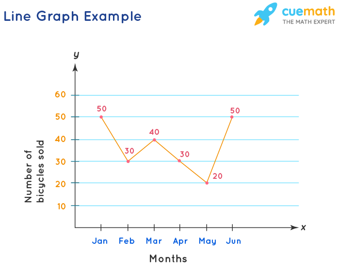
The line graph shown above represents the sale of bicycles by a bicycle company from the month of January till June. Here, the x-axis represents the time interval and the y-axis represents the number of bicycles sold each month. The dark point on the graph denotes a data point. A data point on a line graph represents the quantity or a number that matches a particular time in the x-axis. In the example shown, the number of bicycles sold in the month of January is 50. Similarly, in the month of February 30 bicycles were sold. We can interpret this data for each month using the data point. The line segment connecting these individual data points gives a picture of whether the sale of bicycles is in an increasing or decreasing trend.
A few key takeaways from line graph are as follows:
- A line graph is a graph that is used to display change over time as a series of data points connected by straight line segments on two axes.
- A line graph is also called a line chart. It helps to determine the relationship between two sets of values, with one data set always being dependent on the other data set.
- They are helpful to demonstrate information on factors and patterns. Line diagrams can make expectations about the consequences of information not yet recorded.
- The slope of the line is the most important observation in this case. The slope represents how steep a line is. It helps in comparing the magnitude of change between any two consecutive points on the graph. For example: The steeper the slope, the greater is the change in magnitude between two consecutive points.
Parts of a Line Graph
Line graph consists of a horizontal x-axis and a vertical y-axis. Most line graphs only deal with positive number values, so these axes typically intersect near the bottom of the y-axis and the left end of the x-axis. The point at which the axes intersect is always (0,0). Each axis is labeled with a data type. For example, the x-axis could be days, weeks, quarters, or years, while the y-axis shows revenue in dollars. Data points are plotted and connected by a line in a "dot-to-dot" fashion.
Let's understand the various parts of a line graph.
- Title: The title of the graph tells us what the graph is all about, i.e., what information is depicted by the graph.
- Labels: The horizontal axis across the bottom and the vertical label along the side tell us what kinds of data are being shown.
- Scales: The horizontal scale across the bottom and the vertical scale along the side tell us how much or how many.
- Points: The points or dots on the graph represent the (x,y) coordinates or ordered pairs. More than one data line can be present in a line graph. Here, data on the horizontal axis is the independent variable, and data on the y-axis is the dependent variable.
- Lines: Straight lines connecting the points give estimated values between the points.

While comparing data sets, the line graph is only useful if the x and y axes follow the same scales. The x-axis is also known as the independent axis because its values do not depend on anything. For example, time is always placed on the x-axis since it continues to change regardless of anything else. The y-axis is also known as the dependent axis because its values depend on variables on the x-axis: at this time, the company had these many sales. The result is that the straight line always progresses in a horizontal fashion and for each x value, there is a unique value of y. For example, the company cannot have two different value sales at the same time.
Reading a Line Graph
Consider the following steps to read and interpret a line graph:
- Look at the title.
- See the labeling of axes.
- Check out the emerging patterns to understand the trend.
- See the data values to get exact figures.
Example:
Observe the line graph shown below. Let us read it and list out the key observations from the line graph.
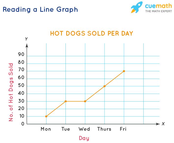
- This graph provides information about the daily sale of hotdogs every day of the week.
- The line graph has an increasing slope, which means that the sale of hot dogs has increased starting from Monday. We can clearly see that there were 40 more hot dogs sold on Thursday than on Monday. (50 were sold on Thursday and 10 were sold on Monday, so the difference is 50 - 10 = 40)
- One other important observation is that the sale remains the same on Tuesday and Wednesday.
Plotting a Line Graph
The following steps can be used to create a line graph.
- Create a table: Draw the x- and y-axes on a page. On the top of the page, place a title that briefly describes the purpose of the chart.
- Label each axis: If time is one of the factors, it should go along the horizontal (x) axis. The other numeric values, i.e., the dependent variables measured should be placed along the vertical (y) axis. Each axis should be labeled with the name of the numeric system as well as the measurements being used. For example, you may label the x-axis with independent variables like hours or months, indicating that each number written on the axis is the number of hours or months. Divide each axis evenly into applicable increments.
- Add data: Data for a line graph is usually presented in a two-column table corresponding to the x- and y-axes. Once you've added your data, your line graph will automatically reflect its values.
- Create a key: If you are comparing multiple items, you'll want to create a key that identifies what each line is by its color.
Important Notes on Line Graph:
Here are some key points to remember while creating line graph.
- Choose the specific title showing the exact information.
- Take variable values in short terms to understand them easily.
- Do not mess with too many lines over the graph. The maximum should be four lines to facilitate comparisons.
Kinds of Data in a Line Graph
Line charts can display continuous data over time, set against a common scale, and are therefore ideal for showing trends in data at equal intervals or over time. As a general rule, use a line chart when your data includes non-numeric (category) data. For example, a shopkeeper wants to analyze the growth of his business over a period of one year. So, the time factor, i.e., the names of months would be considered on the horizontal x-axis whereas the vertical y-axis will be used to depict the numerical values, i.e., the monthly profit.
Line Graph Advantages
The advantages of using line graph are as follows.
- It is beneficial for showing changes and trends over different time periods.
- It is also helpful to show small changes that are difficult to measure in other graphs.
- Line graph is common and effective charts because they are simple, easy to understand, and efficient.
- It is useful to highlight anomalies within and across data series.
- More than one line may be plotted on the same axis as a form of comparison.
Line Graph Disadvantages
Here are some limitations of using line graph.
- Plotting too many lines over the graph makes it cluttered and confusing to read.
- A wide range of data is challenging to plot over a line graph.
- They are only ideal for representing data that have numerical values and total figures such as values of total rainfall in a month.
- If consistent scales on the axis aren't used, it might lead to the data of a line graph appearing inaccurate.
- Also, line graph is inconvenient if you have to plot fractions or decimal numbers.
Line Graph vs Scatter Plot
Observe the two graphs shown below and notice the difference between the two,
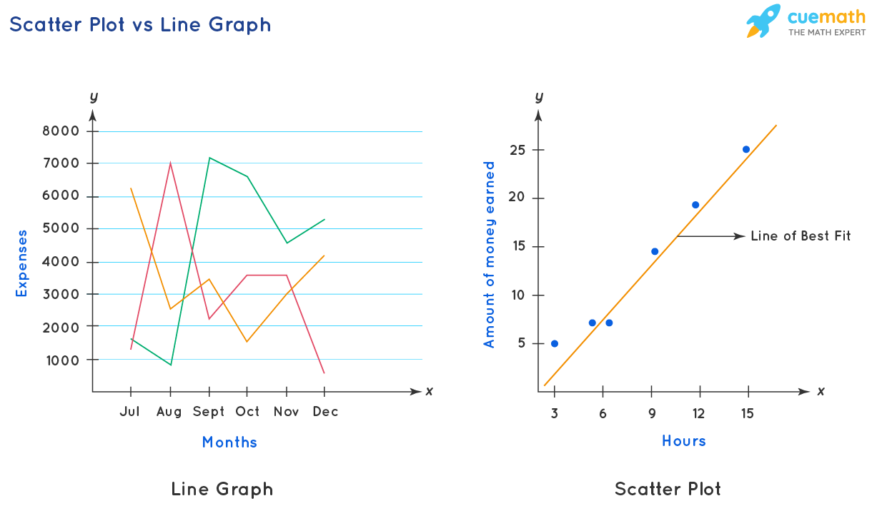
Line graph and scatter plot are two different tools. Both the tools have data points that are marked with small circles. A line graph connects every data point with the next data point with a line segment, whereas a scatter plot does not connect individual data points. We can know the trend of growth by looking at the line in a line graph that connects the data points, whereas in a scatter plot a line of regression or the 'line of best fit is drawn which depicts the relationship between two different sets of data along the x-axis and the y-axis. The key difference between a line graph and a scatter plot is that line graph gives how quantitatively the data along the y-axis increases with respect to a given time period, whereas, in a scatter plot, we can see how the data represented in the y-axis changes with increase in the value of data in the x-axis. Graph A is a line graph whereas Graph B is called the scattered graph or scatter plot. These two types of charts record data information on both X and Y axes. The table shown below lists the key differences between a line graph and a scatter plot.
| Line Graph | Scatter Plot | |
|---|---|---|
| Purpose | Shows continuous data over a period, setting against a general scale, and connecting individual data points together, ideal for showing growth rate or trends at even intervals. | It works best when comparing large numbers of data points without regard to time. This tool is very powerful when we are trying to show the relationship between two variables (x and y-axis), for example, a person's weight and height. |
| Axes | The x-axis can only show texts (Like the name of months, years), which usually refer to non-mathematical data, at equally spaced intervals. the y-axis can show numbers. | x-axis and the y-axis can show numbers. Data are not evenly distributed. |
| Plots | Line segments are used to join the data points. | Data points are not joined here, but a line of best fit is drawn to know the relationship between the data along the x and the y axis. |
| Amount of Data | It cannot handle a large amount of data. | It manages a large amount of data to help in understanding patterns in the data. |
Related Topics:
Check out some interesting articles related to a line graph.
Line Graph Solved Examples
-
Example 1: A bookshop made a line graph of the number of books it sold each week during a certain period. Based on the information provided in the above line graph, find how many fewer books were sold in week 8 than in week 7.
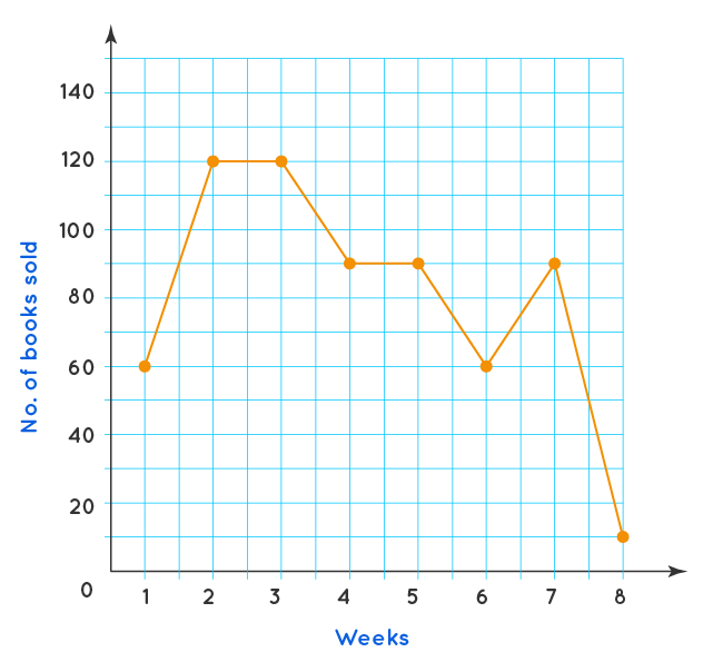
Solution:
Number of books sold in week 7 = 90
Number of books sold in week 8 = 10
So, the difference = 80
Therefore, there were 80 fewer books sold in week 8 as compared to week 7. -
Example 2: The temperature of a city from 5 a.m. to 8 p.m. on a day was recorded in the form of a line graph as shown below. Study the graph and answer the following questions.
a) At which time of the day was the temperature 40° F?
b) What was the maximum recorded temperature?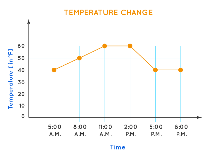
Solution:
a) The temperature was 40° F at 5 a.m. and from 5 p.m. to 8 p.m.
b) The maximum recorded temperature was 60° F. -
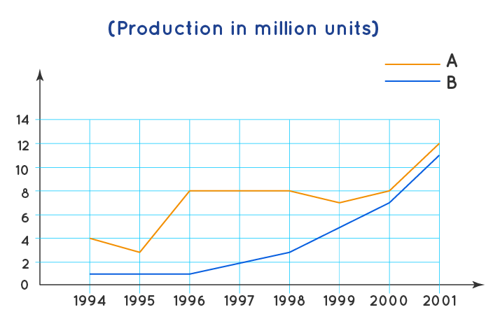
Example 3: Study the following graph to answer the given questions: Production of two companies A & B over the years is as shown in the figure. For company A, what is the percent decrease in production from 1994 to 1995?
Solution:
Company A's production in 1994 = 4 million units; Company A's production in 1995 = 3 million units; Difference in production 1994 to 1995 for company A = 4 - 3 =1; Original production = 4
Using the formula :
% Decrease = (Decrease in production/Original production) × 100
Required percentage decrease = \( \dfrac{1}{4} \times 100 = 25\% \)
Therefore, there was a decrease of 25%.

FAQs on Line Graph
What is a Line Graph?
A line graph is a tool used in statistics to analyze the trend of data that changes over a specified interval of time in a coordinate plane. Here the time and data are represented in an x-and-y-axis. It is also called a line chart. The x-axis or the horizontal axis usually has the time; and the data that changes with respect to the time is present in the vertical axis or the y-axis. Data obtained for every interval of time is called a 'data point'. It is represented using a small circle. An example of a line graph would be to record the temperature of a city for all the days of a week to analyze the increasing or decreasing trend.
What is a Data Point in a Line Graph?
The point of intersection on the line graph that matches a time on the x-axis to a data value on the y-axis is called a data point. The data points in a line graph are represented using small circles or dots. They are connected by line segments to determine the growth trend.
What are the Parts of a Line Graph?
The important parts of a line graph are as follows.
- Title: Represents what information is depicted by the graph.
- Labels: The names given to the horizontal x-axis and the vertical y-axis that tell us about the kinds of data that are being shown.
- Scales: The total number of units or quantity along the horizontal and vertical axis. For example, if we are measuring the sale of a number of cups of coffee for every hour in a day, then in the x-axis we can have hour 1, hour 2, hour 3, and so on. In the y-axis, we can have 10, 20, 30, and so on. In the y-axis, the scale is an interval of 10 units, since the number increases by 10 consecutively.
- Points: The points or dots on the graph represent the (x,y) coordinates or ordered pairs. More than one data line can be present in a line graph. Here, data on the horizontal axis is the independent variable, and data on the y-axis is the dependent variable.
- Lines: Individual line segment connecting two adjacent data points form a line in a line graph.
What are the Steps in Creating a Line Graph?
The steps in creating a line graph are as follows.
- Give a title to the line graph.
- Draw the x-axis and y-axis on the page and label them. The x-axis is an independent variable which is usually a time period and the y-axis is a dependent variable which is usually a quantity. For example, you may label the x-axis with independent variables like hours or months, indicating that each number written on the axis is the number of hours or months. Divide each axis evenly into applicable increments.
- Add data to the line graph by creating a two-column table with values and plot the data points and join them by line segments.
- If multiple line items are being compared, lines with different colors should be drawn to avoid confusion and a key should be created to clearly distinguish each one of them.
What is a Straight Line Graph?
A straight-line graph is a linear graph involving two variables. Its general form is y = mx + c, where 'x' and 'y' are the variables, 'm' is the slope pf graph and 'c' is constant which is the value of 'y' when x = 0.
What are the Advantages of a Line Graph?
A line graph is a tool to do trend analysis on a subject over a period of time. There are some advantages of using a line graph. They are as follows.
- A line graph shows the increase or decrease in trends over different intervals of time, be it a week, or for a number of months or years.
- It helps in detecting small changes that are difficult to measure in other graphs, as we have line segments connecting every 2 data points.
- It is simple and easy to read and interpret.
- It is helpful in highlighting anomalies within and across data series.
- Comparison of data can be done by plotting more than one line. This is done to effectively compare more than one set of similar types of data for varying periods of time.
What are the Disadvantages of a Line Graph?
Though a line graph is easily readable and easy to use, there are some disadvantages too in using them. They are as follows.
- Too many lines in a line graph make it unreadable and cluttered.
- Only a limited range of data can be plotted to make the best use of a line graph.
- They are only ideal for representing data that have numerical values and total figures such as values of total rainfall in a month.
- Inconsistent scales across the axes would lead to inaccurate data.
- They are not useful when it comes to plot fractions and decimals.
What are the Differences Between a Line Graph and a Scatter Plot?
- Line graph is useful when there is a need to analyze continuous data over a period of time, whereas, scatter plots work best when comparing large numbers of data points without regard to time.
- Line graph has only time periods across the x-axis and any quantitative data along the y-axis, whereas, scatter plots have quantitative data along both the x-axis and y-axis.
- Line graph uses line segments to join the individual data points, whereas, in a scatter plot, data points are not joined here, but a 'line of best fit' is drawn to know the relationship between the data along the x-axis and the y-axis.
- Line graph is useful to analyze the trends of a small amount of data, whereas, scatter plots are used to explore the patterns of large amounts of data.
What is a Double Line Graph?
It is a line graph representation of two sets of information on a single graph. It is generally used for the purpose of comparing the outcomes, information, or events. Usually, the lines are denoted by different colors to have clarity of the data.
How Many Lines Can be Present in a Line Graph?
There can be more than one line in a line graph as it helps to compare the data. It is advisable to use different colors to avoid confusion and errors in interpretation. Avoid using more than 4-5 lines simultaneously as the lines may become an unreadable tangle and you may have a hard time interpreting them.
math program
math program
visual curriculum
